In this tutorial, you will learn how to plot overlapping histograms on the same graph. This is helpful when you want to show a comparison between two sets of data.
Step 1: Import the matplotlib library and matplotlib.pyplot interface
import pandas as pd

import matplotlib
%matplotlib inline
import matplotlib.pyplot as plt
Step 2: Load the dataset
baby_df = pd.read_csv('baby.csv')
baby_df.head(5)

Step 3: Plot overlapping histograms
# Split the dataframe by column value
smoker_df = baby_df.loc[baby_df['Maternal Smoker'] == True]
nonsmoker_df = baby_df.loc[baby_df['Maternal Smoker'] == False]

# Generate histogram plot
plt.hist(smoker_df["bmi"],
         label='Maternal Smokers BMI')

plt.hist(nonsmoker_df['bmi'],
         label='Maternal Non-smokers BMI')

plt.legend(loc='upper right')
plt.title('Mother BMI for smokers and non-smokers')
plt.show()
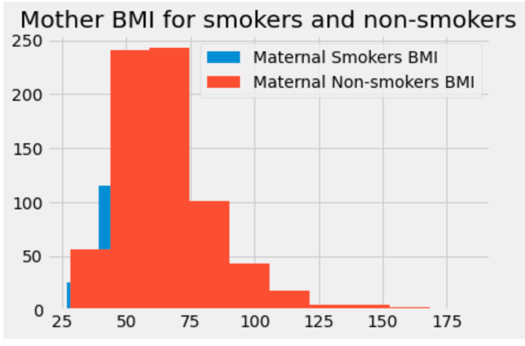
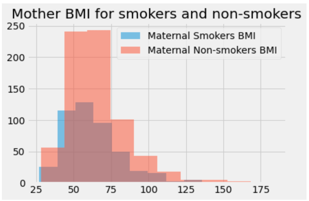
We’ve generated overlapping histograms! But, in this graph, it’s hard to see the blue histogram. We can give the histograms an opacity value less than 1.0 so that they become translucent, or see-through. This will allow us to see both of them.
Set alpha values
The only difference is adding the optional alpha parameter to the hist method. The alpha value can be any decimal between 0 and 1. Each plot can have a unique alpha value.
# Generate histogram plot
plt.hist(smoker_df["bmi"],
         alpha=0.5,
         label='Maternal Smokers BMI')

plt.hist(nonsmoker_df['bmi'],
         alpha=0.5
         label='Maternal Non-smokers BMI')
You can also have more than 2 overlapping plots. In this case, it can be helpful to manually set the color for each histogram. We can do this by adding the color parameter to each hist call:
plt.hist(dataset['value'],
         alpha=0.5,
         label='val 1',
         color='red') # customized color parameter

plt.hist(dataset['value2'],
         alpha=0.5,
         label='val 2',
         color='green')

plt.hist(dataset['value3'],
         alpha=0.5,
         label='val3',
         color='yellow')
